Have you noticed the buzz around the phrase “Why is Duolingo icon melting?” This intriguing question has been making waves in the Duolingo community.
At first glance, it may sound like a quirky internet trend, but it holds deeper significance tied to the platform’s evolving design and functionality.
Whether it’s the app’s vibrant UI, algorithm updates, or unexpected technical glitches, users are eager to decode what “melting” truly symbolizes.
In this guide, we’ll unravel the mystery behind this phrase, exploring its potential meanings and how it impacts your Duolingo experience.
From recent app updates to the creative language of its user base, this discussion promises to be both insightful and entertaining.
Dive in to discover why “melting” might just be the term redefining your favorite language learning app.
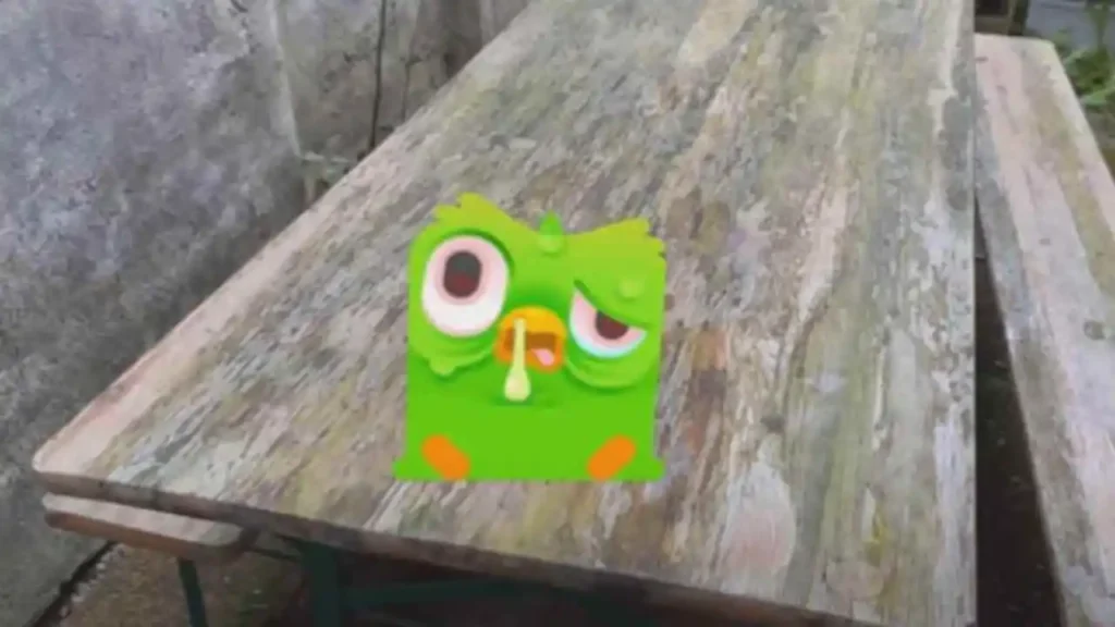
Why does Duolingo bird look sick?
The Duolingo bird, famously known as Duo, has become an iconic figure in language learning.
However, if you’ve noticed Duo looking “sick” or less vibrant in the app, you’re not alone.
This curious phenomenon could be tied to several factors: special animations during app updates, playful user-driven trends, or gamified consequences for incomplete lessons.
Duolingo occasionally tweaks Duo’s appearance as part of interactive updates to keep users engaged.
This visual cue is a creative nudge to stay consistent with your language goals while adding a touch of humor to the experience.
For instance, Duo might appear “sick” or unwell if you’ve skipped lessons or need encouragement to continue your streak.

In this section, we’ll explore what might be causing Duo’s unusual appearance, from playful in-app features to how the community interprets these changes.
Stay tuned as we decode the mystery of the “sick” Duolingo bird and what it means for your language-learning journey!
User Reactions to Duo’s Sick Look
As we know that internet has a unique way of expressing its emotions, and Duo’s “sick look” is no exception.
This unexpected transformation has sparked countless memes, debates, and discussions across platforms like Twitter and Reddit.
The question remains: what exactly do users feel when they see this altered appearance of the iconic Duolingo bird?
Breakdown of user reactions
Meme Culture Explosion: Social media has been flooded with memes poking fun at Duo’s “sick look.” Many users jokingly blame themselves for neglecting lessons.
Concerned Fans: Dedicated learners express curiosity about the deeper meaning behind the visual change, wondering if it symbolizes a shift in the app’s features or tone.
Confusion and Speculation: Many are puzzled, wondering if this design change has a hidden message or is simply a temporary marketing tactic.
Behind Duolingo’s Strategy
Duolingo’s iconic design is far more than just playful visuals. It’s a masterclass in user motivation.
By incorporating interactive features like Duo’s expressions or the recent “sick look,” Duolingo effectively uses visual cues to subtly nudge users toward consistency in language learning
How Visual Cues Motivate Users
Visual cues like Duo’s changing emotions tap directly into human psychology, encouraging users to associate progress with positivity and neglect with guilt or concern. For example:
Streak Rewards: A smiling Duo congratulates learners for maintaining streaks, boosting their motivation to continue.
Expressions of Concern: Features like Duo’s “sick” look evoke empathy, making users feel responsible for their learning journey.
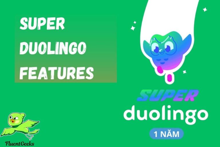
Want to know about what is super duolingo and its features.
